The below set of branding/logo guidelines are not just good ideas, they are boundaries put in place to ensure consistent branding across all of our campuses worldwide.
Resisting the urge to adjust elements especially in the identity itself, will lead to our audience recognizing, remembering, and connecting with what our branding stands for.
GENERAL LOGO
This is our general Influencers logo and should be used whenever possible. It’s consistent and proper use is crucial. Reproduction of this logo and its supporting elements should be in accordance with the standards set out in these guidelines.
LoGO EXCLUSION ZONE
The logo needs to be seen clearly, so it should never be crowded by other elements. To prevent this, the logo should always have an area of clear space, an exclusion zone.
The exact sizing adjusts as the logo is scaled up and down but it is always 1/2 the height of the logo, as illustrated.
GENERAL COLOUR VARIANTS
The Influencers Logo is a three colour logo designed to be legible on both light and dark backgrounds regardless of image complexity.
TWO-COLOUR VARIANT
When and if appropriate, we also have a two-colour variant to be used on occasion if the background calls for a lighter mark.
One-colour variant
When and if appropriate, we also have black and white colour variants to be used on occasion if the background allows.
SOCIAL MEDIA VARIANTS
This is the South Campus example (on instagram) when the platform calls for a circular display image.
Photographs with organically strong/bold colour tints (coming from stage lights or screens) are useful as these display icons are usually very small which disadvantages image complexities.
COLOUR PALETTE
Logos should only be used with a solid colour exampled or with the imagery set for social media only.
To achieve consistent colour reproduction across different mediums and materials, the chart includes CMYK and RGB values.
Fonts
Helvetica Neue is a great typeface that comes in a wide variety of weights and styles and even has Condensed and Extended versions within the family. It offers a huge selection of choices while keeping the consistency of using the same font family. Because the font family is so broad, it offers the freedom to do quite a bit from a design standpoint but it also keeps the look and feel consistent to the brand.
The great thing about using a classic typeface like Helvetica is that there is so much variety within the font family that the possibilities it has to offer are virtually endless, but at the same time it keeps the possesses a visual consistency that is very hard to achieve when mixing typeface.
You can download the Helvetica Neue family here.
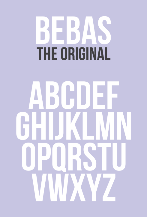
Bebas Neue
Bebas Neue is a sans serif font by Ryoichi Tsunekawa. It has grown in popularity and become something like the “Helvetica of the free fonts” in the last few years. Ideal for applications in headlines and bold type, it's a good alternative or pairing option with Helvetica Neue.


